
cutlistlab › Manual › On your phone
Chapter 27
On your phone
What is different on a small screen, and how to use the tool next to your saw or in the store.
The narrow layout
Below about 1000 pixels the tool switches to a single column. At the bottom sits a tab bar to move between the parts, the plan and the result.
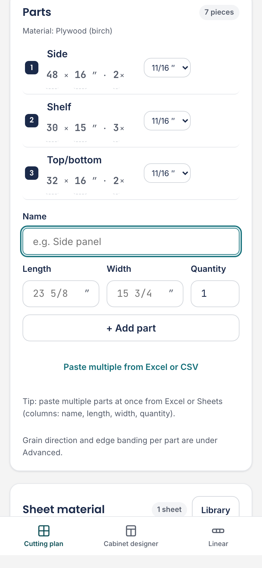

Otherwise it is the same tool: the same calculation, the same exports, the same project. A few things simply sit elsewhere.
| What | Wide layout | Narrow layout |
|---|---|---|
| Standard / Advanced | Does not exist; use the toggles in Settings. | In the menu behind the project name. |
| View options | Icon bar above the cutting plan. | Menu behind the sliders button. |
| Optimize for | Always visible. | Under Advanced. |
| What do I need | Icon bar above the plan. | Button with the display actions. |
Putting it on your home screen
Add the app to your home screen and your cutting plan is right there for your next project. You get a strip for that with the Add button.
On an iPhone it works slightly differently: In Safari, tap the share icon and choose: Add to Home Screen.
After that the tool opens like an app, without an address bar. It still runs in your browser, so your projects are the same ones.
At the saw and in the store
Two things make a phone genuinely useful here.
- Cut along fills the screen and walks through the cuts one by one, so you do not have to scroll with sawdust on your hands. See Cut list and cutting order.
- What do I need gives you the shopping list with quantities and guide prices, to work through in the store. See What do I need.